Did you know that your email signature is like a virtual handshake? It’s a subtle yet powerful element of your online presence.
Whether you’re a professional or an individual, the font you choose for your email signature can convey a lot about your style and personality.
A well-designed email signature is the equivalent of a perfectly tailored suit – it’s the final touch that elevates your professionalism, leaving a lasting impression long after the email fades away.
Statistics show that 70% of recipients notice your email signature. It’s your digital handshake, your silent billboard – a tiny space with the potential to shout your brand, personality, and even your quirky side. So, why not make it count?
In this blog post, we’ll explore the world of email signature fonts, the best choices, how to pick the perfect one, and the potential pitfalls of making the wrong selection.
SHORT ANSWER
Best Fonts for Email Signatures
Before we delve into the nitty-gritty, let’s unveil the stars of the show – the top 16 fonts that’ll make your signature sing:
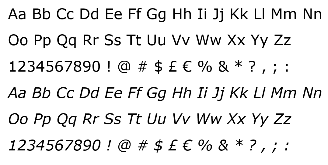
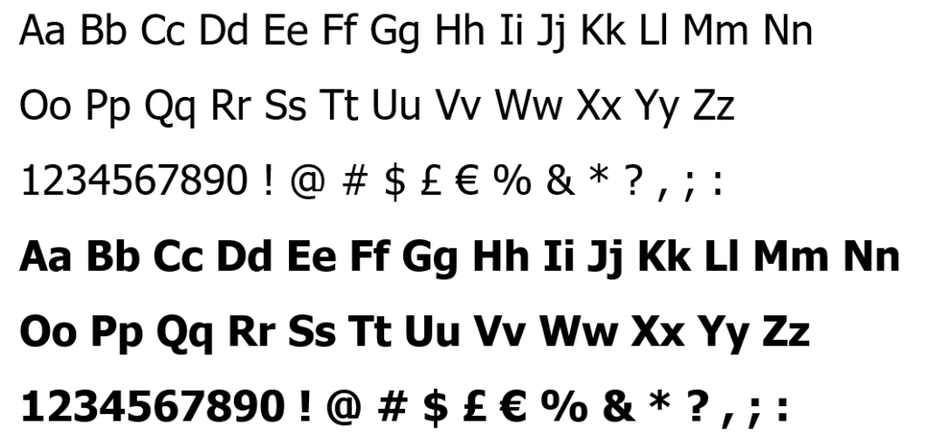
- Arial: The go-to for its clean lines and universal appeal.
- Verdana: Its subtle curves add a touch of warmth to your message.
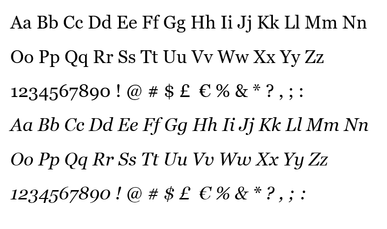
- Georgia: Elegant and timeless, perfect for a professional touch.
- Trebuchet MS: A clear and readable san-serif font with a slightly humanist touch.
- Times New Roman: Classic and authoritative, ideal for formal settings.
- Helvetica: A timeless and classic font exuding professionalism and neutrality.
- Lucida Sans: A modern, clean sans-serif font with excellent readability.
- Tahoma: Familiar and versatile, a great choice for everyday emails.
- Courier New: A monospaced font that adds a touch of vintage charm.
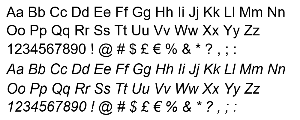
- Calibri: Modern and sleek, perfect for a minimalist approach.
- Roboto: A contemporary choice that’s popular across platforms.
- Open Sans: A friendly and approachable font for informal settings.
- Lato: A versatile font with a touch of personality, perfect for branding.
- Montserrat: A modern and geometric font with a touch of edge.
- Raleway: A clean and versatile font with excellent readability on all screens.
- Poppins: A friendly and approachable font with a touch of whimsy.
How to Choose the Best Font for Email Signature
Now, choosing the right font isn’t just about picking your favorite color. It’s about finding the perfect match for your brand, message, and personality. Here’s your guide to navigating the font jungle:
Choose a Legible Font
Imagine receiving an email with a signature so stylized that you struggle to decipher it. To avoid this, opt for fonts that are clear, easy to read, and won’t leave your recipients squinting at their screens.
Choose a Web-Safe Font
In the vast landscape of the internet, not all fonts render the same way. Stick to web-safe fonts to ensure your signature appears consistent across various devices and email clients.
Size
Size matters – especially in the world of fonts. Find the sweet spot that allows your text to be easily readable without overwhelming the recipient.
Color
Selecting an appropriate color for your email signature font is crucial. It should complement your overall design and remain professional. Avoid overly bright or contrasting colors that may distract or strain the eyes.
Readability
Your email signature is not the place for overly decorative or intricate fonts. Prioritize readability to ensure your recipients absorb the information effortlessly.
Consistency
Consistency is key to building a recognizable brand. Stick to a consistent font across your branding materials and email signatures to enhance professionalism.
Personality
While professionalism is vital, injecting a bit of personality through your font choice can make your signature memorable. Strive for a balance that aligns with your personal or brand image.
Versatility
Consider the versatility of the font in different contexts. A font that looks good in your email signature should also be suitable for other marketing materials or documents.
Fonts Differences: Email Safe Fonts, Web Safe Fonts, and Fall-Back Font
Now, before we get lost in the world of serifs and kerning, let’s clear some air:
Email Safe Fonts
Email safe fonts ensure that your email signature maintains its visual appeal across various email clients. Examples include Arial, Verdana, and Georgia.
Web Safe Fonts
Web safe fonts are those widely supported across different web browsers. Fonts like Times New Roman, Courier New, and Arial fall into this category.
Fall Back Fonts
In case your preferred font isn’t supported, having a fallback font ensures your email signature remains readable. Common fallback fonts include Sans-serif and Serif fonts.
The 16 Top Email Signature Fonts: A Closer Look
Now that we’ve laid the groundwork, let’s meet the stars of the show up close and personal. Each of these 16 fonts brings something unique to the table, waiting to be unleashed in your signature:
1. Arial
Designed by Robin Nicholas and Patricia Saunders in 1982
This classic sans-serif font is the epitome of versatility and professionalism. Its clean lines and universal appeal make it a safe choice for anyone who wants a signature that’s both readable and reliable. Think of it as the little black dress of the font world – always appropriate, always stylish.
2. Verdana
Created by Matthew Carter in 1996
Verdana’s subtle curves and slightly wider letterforms inject a touch of warmth and friendliness into your signature. It’s a great choice for those who want to project a more approachable and personable image. Imagine it as a cozy sweater – comfortable, inviting, and perfect for everyday communication.
3. Georgia
Developed by Matthew Carter and released in 1993
If you’re aiming for an air of elegance and sophistication, look no further than Georgia. This serif font with its subtle strokes and timeless beauty evokes a sense of tradition and authority. Think of it as a well-tailored suit – crisp, polished, and perfect for making a lasting impression.
4. Trebuchet MS
Created by Vincent Connare in 1996
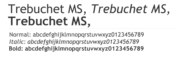
Imagine it as the architect’s go-to tool, clean lines meeting subtle curves for a touch of personality. Its slightly humanist feel brings warmth to your email, making it perfect for those who want to be professional but approachable. Its geometric shapes project confidence without being brash, making it a great choice for anyone who wants their signature to say, “I deserve your attention.” But unlike some bold fonts, it stays clear and readable, even on small screens.
5. Times New Roman
Commissioned in 1931 by the Times newspaper
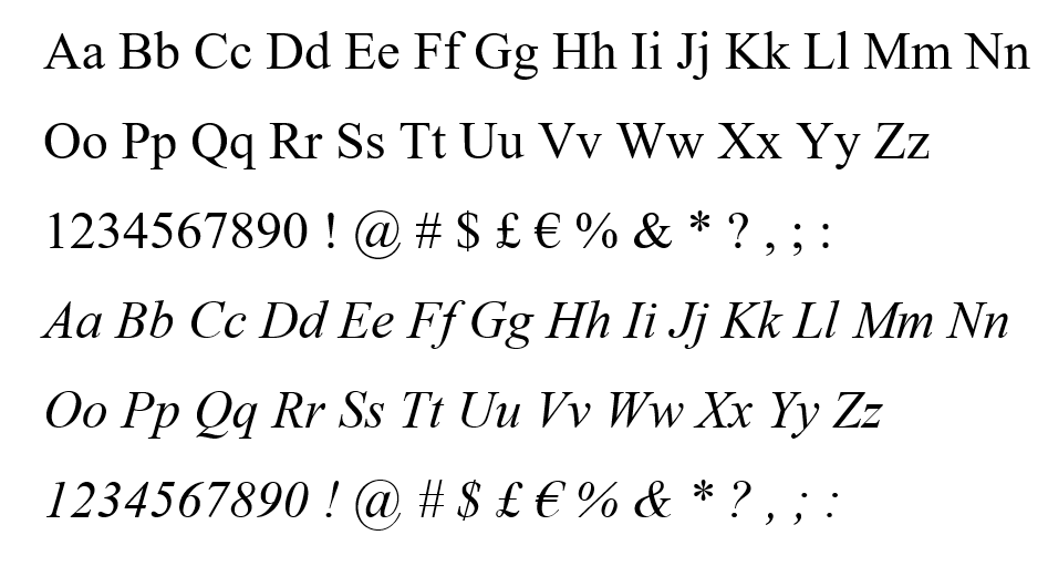
The quintessential font of formal communication, Times New Roman instantly commands respect and seriousness. Its familiar serifs and slightly condensed letterforms exude an air of authority and tradition. Think of it as a vintage typewriter – dependable, reliable, and perfect for when you need to sound your most professional.
6. Lucida Sans
Developed by Charles Bigelow and Kris Holmes in 1985
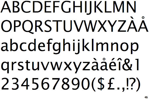
For a modern and clean aesthetic, Lucida Sans is your go-to. This sans-serif font with its geometric shapes and excellent readability offers a crisp and contemporary feel. Imagine it as a sleek minimalist office – uncluttered, efficient, and perfect for those who value clarity and professionalism.
7. Helvetica
Developed in 1957 by Max Miedinger and Eduard Hoffmann
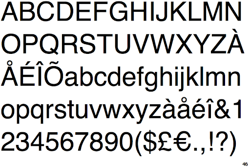
Helvetica is the font equivalent of a perfectly tailored suit – timeless, elegant, and universally admired. Its clean lines and neutral aesthetic project an air of professionalism and authority, making it the go-to choice for diplomats, executives, and anyone who wants their signature to command respect.
8. Tahoma
Designed by Matthew Carter in 1994
This familiar face greets you from dialogue boxes and menus, making it a comfortable choice for everyday emailing. Its clean lines and slightly condensed letterforms offer excellent readability without feeling overwhelming. Think of it as a friendly neighbor – reliable, easy to talk to, and perfect for everyday communication.
9. Courier New
Designed by Howard “Bud” Kettler in 1955
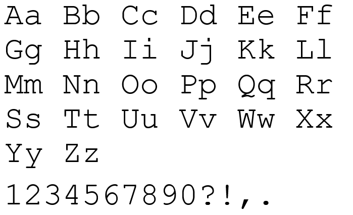
Take a step back in time with the vintage charm of Courier New. Its monospaced font, reminiscent of typewriters, adds a touch of whimsy and personality. Ideal for creative fields or those who want to stand out from the crowd. Imagine it as a quirky antique typewriter – nostalgic, unexpected, and perfect for expressing your unique style.
10. Calibri
Designed by Lucas de Groot in 2002
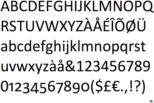
Modern and sleek, Calibri is a popular choice for those who appreciate a minimalist approach. Its clean lines and slightly rounded strokes offer a fresh and contemporary feel. Think of it as a Scandinavian design studio – uncluttered, functional, and perfect for those who value simplicity and elegance.
11. Roboto
Developed by Christian Robertson in 2011
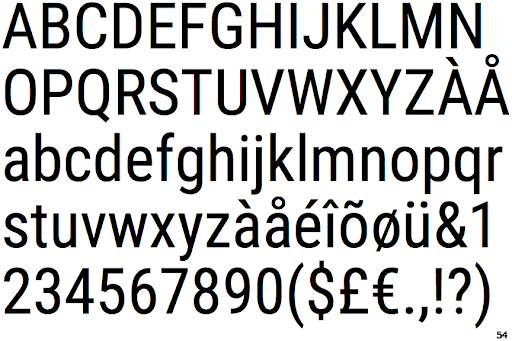
This contemporary font has become a ubiquitous presence across platforms, and for good reason. Its friendly curves and open letterforms make it highly readable on any screen. Imagine it as a chatty barista – approachable, casual, and perfect for informal emails or social media interactions.
12. Open Sans
Designed by Steve Matteson in 2011
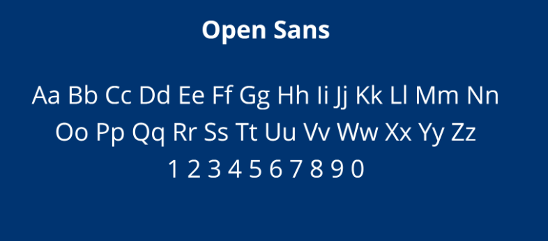
For a warm and inviting signature, Open Sans is your friend. Its slightly condensed shapes and friendly curves create a sense of approachability and openness. Think of it as a cozy coffee shop – comfortable, casual, and perfect for connecting with your audience on a personal level.
13. Lato
Developed by Łukasz Dziedzic in 2010
This versatile font comes in a range of weights, catering to a variety of personalities. Its clean lines and geometric shapes offer a modern and professional feel, while the bolder options can add a touch of statement. Think of it as a chameleon – adaptable, functional, and perfect for tailoring to your specific brand or message.
14. Montserrat
Designed by Julieta Ulanovsky in 2011
Modern and geometric, Montserrat adds a touch of edge to your signature. Its clean lines and slightly narrowed letterforms offer a contemporary and minimalist feel. Think of it as a sleek city skyline – sophisticated, edgy, and perfect for those who value a modern aesthetic.
15. Raleway
Developed by Christian Robertson in 2011
This clean and versatile font is a winner for all-around readability. Its open letterforms and slightly condensed shape make it easy to read on any screen, while offering a touch of modern style. Think of it as a Swiss army knife – functional, reliable, and perfect for any situation.
16. Poppins
Designed by Indian Type Foundry in 2014
Friendly and approachable with a touch of whimsy, Poppins is a delightful choice for informal settings. Its slightly rounded curves and playful letterforms add a touch of personality and warmth. Think of it as a cheerful friend – bubbly, fun, and perfect for injecting a little sunshine into your email interactions.
The Risky Riffs: Fonts You Should Avoid and Why
Not every font is created equal, and venturing into certain territories can lead to disastrous off-key performances. Avoid these risky riffs that can undermine your signature’s harmony:
- Decorative Fonts:While tempting with their flourishes and curls, these often sacrifice readability, leaving your audience confused and frustrated.
- Handwritten Fonts:Charming in theory, but their inconsistent letterforms can be difficult to read, especially on small screens.
- Overly Thin Or Thick Fonts:Thin fonts can disappear on certain devices, while thick ones can overwhelm and overpower your signature.
- Unconventional Fonts:While a touch of personality is encouraged, choosing overly quirky or unfamiliar fonts can alienate your audience.
Pro Tips for Crafting the Perfect Signature Font
Now that you’ve mastered the music theory of fonts, here are some pro tips to craft a signature that truly sings:
Font Size:
Aim for a font size that’s noticeable but not overpowering, around 11-12pt for desktop and 14-16pt for mobile.
Bold and Italics:
Use bold and italics sparingly to emphasize key information without overpowering the message. Avoid overdoing it.
Spacing and Line Breaks:
Emphasize a clean layout with ample spacing and strategic line breaks to create a visually appealing signature.
Call to Action:
Don’t be afraid to experiment and find your perfect font match. Remember, your signature is an extension of your brand, so have fun and let your personality shine through!
A Finale to Remember
Choosing the right font for your email signature is a small act with a big impact. It’s the final flourish that adds personality, professionalism, and even a touch of whimsy to your digital interactions. So, embrace the power of fonts, craft your signature symphony, and leave a lasting impression that resonates with every email you send.
And don’t forget, if you have any specific questions about choosing the perfect font for your email signature, feel free to ask! The stage is yours, maestro, let your signature sing!